
Understanding your survey results
As soon as employees start submitting their responses to a survey and (for anonymous engagement surveys) the anonymity threshold is met, survey admins can view survey analytics. Analytics contains several views to help you discover insights about your people and organization.
Learn more about survey analytics:
- eNPS Engagement Surveys
- Understand Score Calculation
- Lattice Benchmarks for Engagement
- Analyze Employee Survey Data
- Your employee engagement survey results are in. Now what?
View survey results
- Navigate to Admin > Engagement > Surveys.
- Click to select the engagement survey.
- Navigate to the Results tab.
Filter your data
Default and custom fields
Use the filter bar at the top of the Results page to filter survey responses by fields.
Adding multiple fields will require submitters to meet both conditions, whereas applying multiple values within a single field will show submitters who meet either condition. For example, filtering Gender: Female + Department: Engineering will show responses from all the women in the engineering department. Filtering for Department: R&D + Department: Marketing will show responses from employees who are in either the R&D department or the Marketing department.
Save filters by creating a saved view.
Note: want to analyze your survey results by employee data that isn't currently stored in Lattice? Create a custom field to store that data and then assign the relevant values to each employee's profile before you launch your survey. Once the survey ends, you'll be able to filter and sort by all of your custom fields. Common examples of useful custom fields include: region, parental status, recency of last promotion, and remote status.
Compare
Use the Compare dropdown to select a previous survey or Lattice benchmark to compare the current survey against.
Once a filter or saved view is applied, the Comparison score column will appear within the analytics table. This column indicates the difference between the company's current score and the previous survey or benchmark you selected. Users who have had a saved view shared with them can compare their saved view with benchmarks or past surveys.
Note: The Compare option is only available for agree/disagree scale questions (with or without comments).
Learn more in Lattice Benchmarks for Engagement.
List view
Results can be viewed by question or theme in a list format or a heatmap view. Survey analytics default to the List view. Within this view, you can see each theme and question along with its associated score. Clicking on a theme or question row will take you to its details.
Themes
The Themes section includes a list of all themes included in the survey.
Themes that include agree/disagree questions will include a Distribution bar that shows the breakdown of positive, neutral, and negative responses (in green, grey, and red, respectively). To see a count of how many responders fell into each bucket, hover over each color in the bar.
Multiple choice and multiple select questions will not count toward the Distribution bar. If a theme contains only multiple choice or multiple select questions you will see a Distribution callout labeled Not scored.
Questions
The Questions section includes a list of all questions included in the survey.
Agree/disagree questions will include a Distribution bar that shows the breakdown of positive, neutral, and negative responses (in green, grey, and red, respectively) for the question. To see a count of how many responders fell into each bucket, hover over each color in the bar.
Multiple choice and multiple select questions will include a gray Distribution bar showing the response breakdown. A square within the distribution bar will represent each possible response option. To see how many responders fell into each bucket (multiple choice) or the percentage chart (multiple select), hover over the Distribution bar to see the count.
Heatmap view
The Heatmap view compares different groups against each other across multiple questions or themes. It provides the most data in a single visualization. You can apply filters to cut your data further to compare specific employee groupings.
The Overall Score will be in the first row and will show for each field. The Overall Score can also be compared to in order to show the delta. To do this, navigate to the Heatmap > Select Compare survey results > Compare this to the survey's overall score.
Note: Multiple choice and multiple select questions do not count towards the heatmap view.
Group by
Adjust how your information is being presented by selecting Group by and choosing one of the following options:
- Age
- Gender
- Tenure
- Manager
- Department
- Job Function
- Job Level
- Job Type
- Job Title
- Manager of Managers (Note: Employees can have multiple managers of managers so the participation count will be hidden)
- Performance review questions
- Custom fields
Adding filters
You can apply additional filters to your data on top of your selected grouping.
Example:
In a survey, Sarah wants to see how women across each department responded to each theme. Sarah will need to:
Choose the grouping Group by: Department
Filter by Gender: FemaleThe heatmap will show just responses to the questions from women across each department.
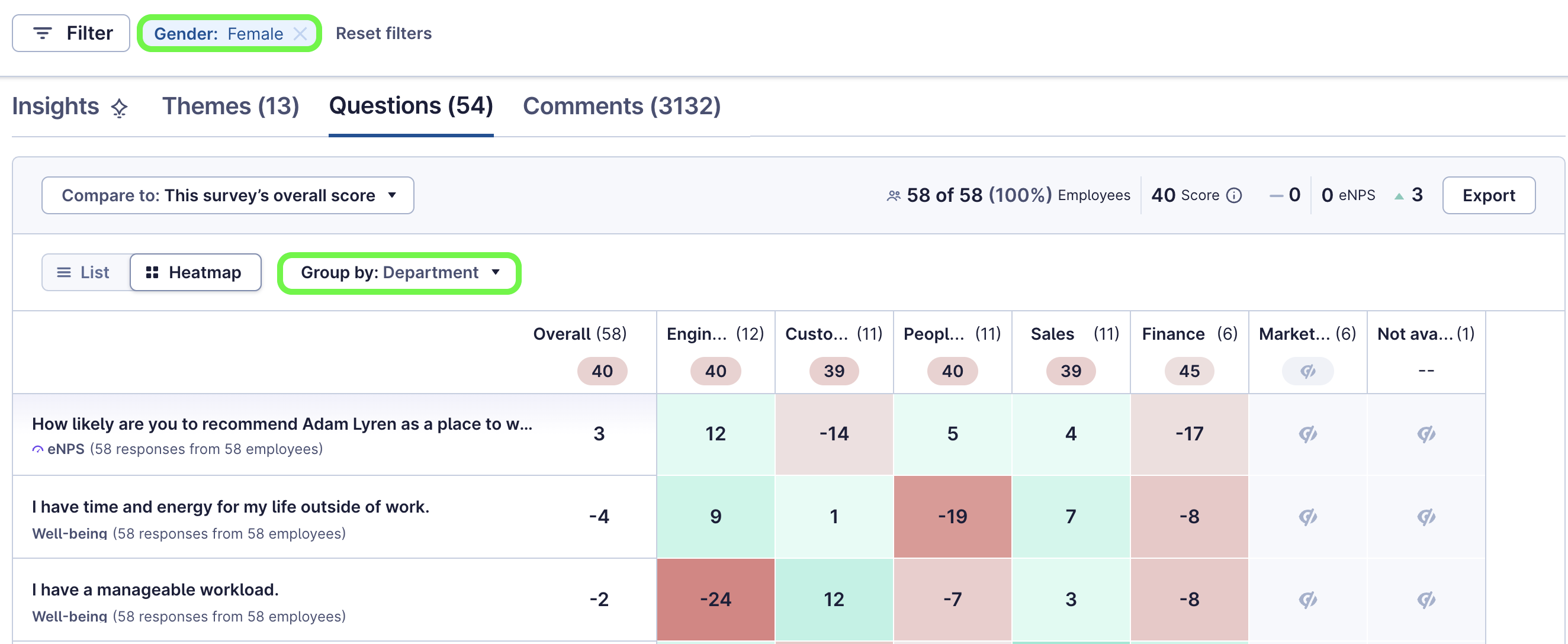
Note: You cannot filter the field you are currently comparing. For example, if you compare by departments, you cannot apply a Department: Engineering filter.
Respondents
For identifiable surveys, admins and shared view owners will be able to navigate to the Respondents tab to view the individual's survey score as well as view the individual's comments by selecting the participant.